
The Next One: Blast Wave 2
Well we have already started development on what will be the next game. Oliver and I have decided to give one of my old titles Blast Wave a bit of a spruce up. We felt that the game had a good solid style with unique elements, the only thing that let it down was its poor graphics / user interface. So as this time around I have an excellent artist we think it can be given the breath of life it deserves.
We started by looking at various parts of the game and what we think let the game down...
**Menus & Interface**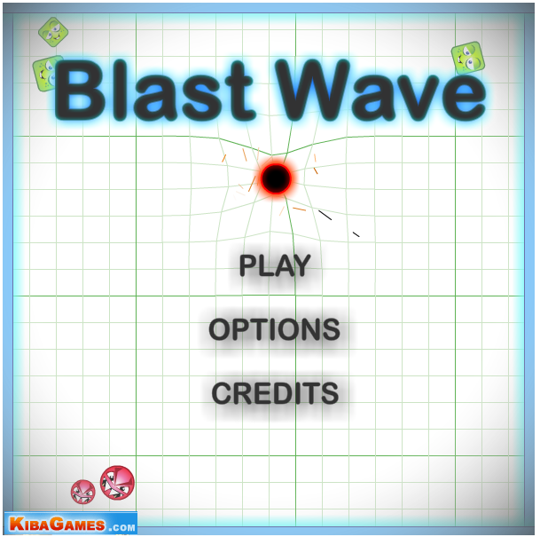
The title screen is one of the first impressions you get about a game. Looking at the current title screen you get a feeling that the project is a little amateurish and as Ade puts it, "very artificial studios". So what we want to do is make it look more professional.
A good example of a professional looking title screen is from Richard over at Photon Storm on his title Kyobi:
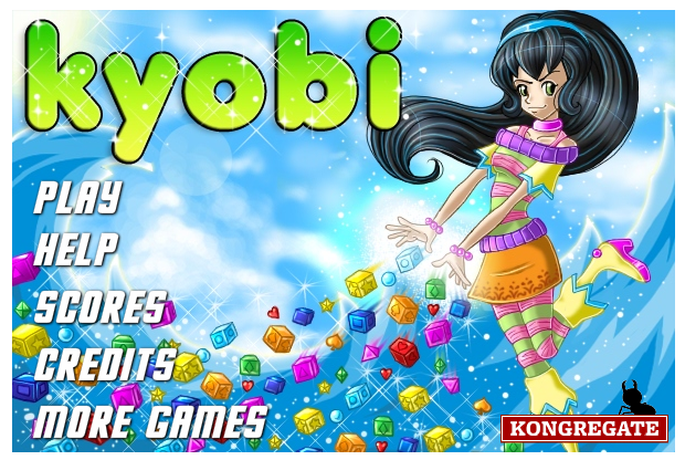
With title screen you get a nice large inviting graphic, it certainly portrays a professional image, it also allows space for a sponsor bottom right, which doesn't detract from the overall look of the screen.
Level Select Screen
The level select screen in Blast Wave 1 again gives you an impression of an amateurish setup:
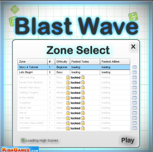
Although it tells you how many levels there are per zone in the graph its not particularly obvious, so when you get in the game its not strikingly obvious why some "zones" last longer than others. Even though the "Fastest Alltime" is nice to be shown on there these days people prefer medals and achievements and things rather than just a straight "top score".
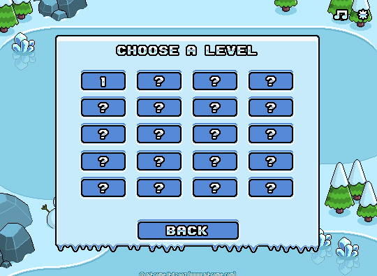
The game Thin Ice has a good example of the more simplistic level select screen we are interested in using:
General Look & Style
One of the most important things that needs to be improved on is the general look and style of the in-game graphics. See a typical scene from the original:
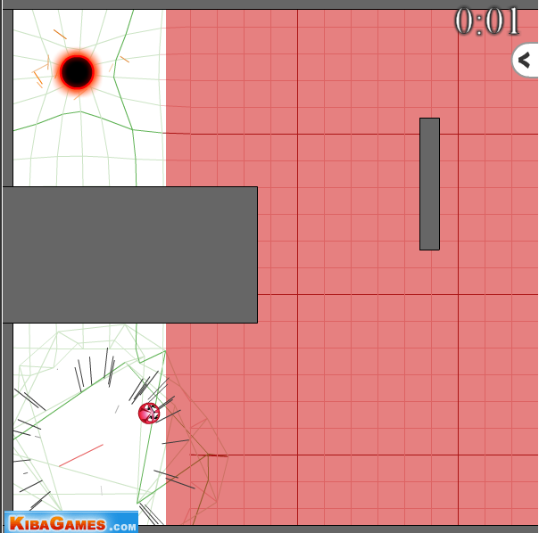
There are many things wrong with this.
Firstly you have no sense of atmosphere all you are greeted with is plain colours, you have no identification with any characters or story. This is okay for some games (think Tetris) but for this to be a success we need a litte more effort on the scenery. Simple grey and red blocks of colour may be very easy to distinguish from one another but it again gives a very "programmer art" feel to things.
The sponsor logo although not massively intrusive, it is easily noticeable and should be placed somewhere that the game takes visual priority.
Using the Lost Garden game prototyping image pack I knocked together something very quickly that I hoped would give a much better visual experience:
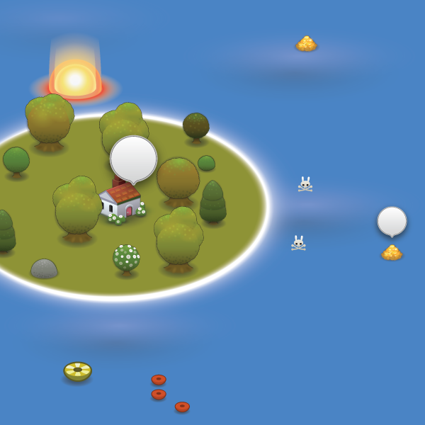
Here are some of my notes that i made in our "design doc" on this:
-
the yellow thing is the "rubber ring player" and is what you want to get the the end (the big red thing at the top)
-
the red things at the bottom are the ones you want to avoid getting in, but these could potentially be removed.
-
you can only affect the water by "pushing" the yellow ring by blasting it causing a wave (you cannot affect the land)
- im not sure exactly this would work with this current art style, how can i make the distortion ripple look side on?
- potentially we can do away with the distortion effect and just have an explosion animation which changes size depending on the size of the explosion..
-
you can pick up gold for extra points
-
you should stay away from the skull and crossbones, if your tube goes near there then a shark comes up and eats you or a squid or something
-
if you hover your mouse over things like the gold or the skull and cross bones then a bubble tool tip is displayed telling you what it does (should make tutorials simpler)
-
note i haven't marked on this mock areas that you cannot blast away but the ring can pass over, ideas on how we can do that? Story and Characters
The story and character art has had some great input by Oliver. He has suggested that the story should be that a ship has been sunk in icy waters and several people have been stranded. You (god) have to use your omnipotent powers to blast the water and aid the survivors in getting to the lifeboats (exit).
I feel its a good, short and to the point story. It also allows us to incorporate all the game play mechanics from the original but give an underlying theme with which to base them in.
To this effect Oliver has made a little character as an example of one of the stranded people:
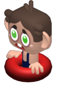
As you can see its very much along the lines of the art style of Monkey Mines which we thought worked rather well.
Anyway, this is just a start, I hope to update more as this project progresses. If you have any ideas/improvements you think would work well I would love to hear them. Either drop me an email (mike.cann@gmail.com) or just leave a comment below.